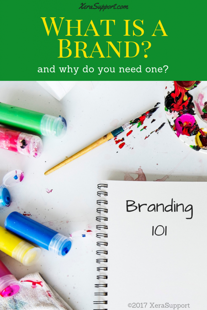
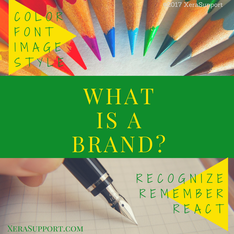
What is a brand?
Your brand is the look and sound of your business that makes you instantly recognizable, forever memorable, and connected emotionally with your audience.
When you look at the big corporations, you notice them wherever you see them. You instantly recognize them. Online, offline, product, office, communication, or whatever piece of that business you come into contact with, they look the same. They have the same logo, colors, phrases, and style across the board.
All of that is called the brand.
It’s what makes you instantly known to the customer. Branding refers to the symbols and style that a business uses. It creates immediate recognition, an emotional connection, and a sense of identity for the business. And it communicates your business’ vision, value and position to the customer as quickly as possible.
What is a brand for?
The purpose of branding is to show the vision, value, and position of your business to your customer. When your potential client sees something from your business, they should instantly know who you are, what you do and they should feel good about your business.
Your business vision is what makes your business unique — so the branding needs to stand out.
The value is what you offer. Every point of contact should tell your customer everything you want to be known for.
And the position is your promise to your customer. So your branding will build that community and connect emotionally with them.
Because a brand is meant to be taken in at a glance, every piece needs to be as packed with meaning as possible.
Where do you use a brand?
The idea with branding is to forge an instant connection with your potential customer. When they see your brand, they should know exactly who you are, what you do, and why they like you, in the first few moments.
You’ll use your brand elements everywhere. You’ll put your branding on every single point of contact for your customer.
It should be part of your website header, on your Facebook page, and on your Twitter profile. You’ll put it on the top of every email and newsletter and flyer you send.
Your brand will make your business card, invoice, or advertising you have consistent. Even on any signage you use, whether it be a small sign on your home office, storefront, vendor booth, or car magnet, you’ll have your brand all over it.
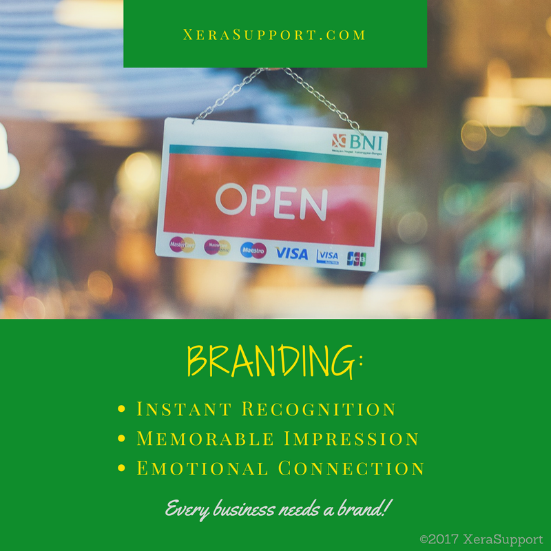
Branding is important for any business.
It helps you stay consistent across platforms, construct community and connection with your potential customers, and generate instant recognition no matter where they see you.
With a good brand, you can tell your customers who you are, what you can offer them, and how you will help them. You’ll do it quickly, easily and without having to actually use words to do it.
And you will attract more customers, and make it easy for them to share you with their friends. Branding is an essential part of marketing.

Make your business stand out.
Your brand is what makes the images and content your business uses for marketing stand out. Branding creates instant connection with your audience. It makes you immediately recognizable. And it conjures up emotion in your audience. A good brand will make them feel good about you.
How do you make a brand?
Brands use colors, fonts, logos, taglines, phrases, even a certain style. The brand is the first thing your customer sees. So it should be immediately recognizable. It should be memorable. And it should bring to mind the unique characteristics of your business right away.
The key to good branding is to make it simple, memorable and consistent across mediums. No matter where you put it, you should be able to recognize it instantly.
You will use color, font, style, images and content to create your brand. Choosing those is the fun part of designing your business, but don’t just pick whatever you like. The elements of your brand will say something to your audience. Make sure they say what you want them to say.
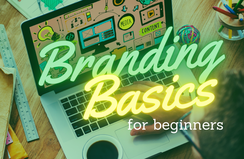
Create your style guide.
To design your brand, you can use a tool called a Branding Board or Style Guide. Brands are designed using four main elements, and you’ll put all these on your branding board or style guide. The elements of a brand are: colors, fonts, style, and voice.
The first element of a brand is the colors.
You’ll want to choose between 3 and 5 different colors, in the same color family. Pick colors that are complimentary. If you remember from elementary art class, complimentary colors are the ones opposite each other on the color wheel. So red and green are complimentary. One of your colors will be your main color, one will be the highlight, and one will be for details. Then you’ll want an accent or two in your design.

What colors should you choose?
You will want to be very deliberate about what family of colors you will pick. Different color groups communicate different emotions.
For example, red is usually a color associated with passion or strong emotion. Green is one that’s connected to nature or money, depending on the shade used. Blue is often seen as peaceful or emotional.
Pick color groups that will help your audience remember your focus as a business.
The second element of a brand is the fonts.
You’ll pick two different groups of fonts – one for your graphics and images, and one for your website and text-based content.
You can be very creative with the fonts you choose for graphics and images. But you need to stay within the very common fonts for text copy. Not every computer that views your copy may have access to your more unusual font choices, so stick within the standard options (Arial/ Times New Roman/ Helvetica/ etc).
For your graphic design needs, you’ll want to choose between 2-4 fonts. Pick a main font that is extremely clear and readable. This is for headlines. Then pick a 2nd font for contrast. And as an option, you may want a 3rd or 4th font for accents and details.
Generally, there are three types of fonts: serif, sans-serif and italic.
Serif fonts are fonts such as Times New Roman. They have little attachments to the letters, almost connecting them together, even though they are print.
Sans-serif fonts are fonts that are cleaner and clearer, without those serif lines.
Italic fonts are the ones that look like cursive or calligraphy. They are often curvy and slanted. Italic fonts make amazing accent fonts, but not great headline or detail fonts.
The third main element of your brand is the style.
In this case, style refers to all the other parts of the images you will create. These are the accents, the lines and patterns that you use in your images.
Style is when you choose whether or not your brand will be feminine or masculine, formal or informal, casual or professional.
Will you use blocky, bold graphic elements? Or lacy, flowing curves? That’s all part of your brand style.
You could have a very professional yet very feminine business oriented brand. You would use curvy flowing lines, but they would be simple and clean, without a lot of detail.
A more casual, masculine lifestyle brand may use more geometric shapes, but the design will have triangles and circles over squares and rectangles.
For inspiration on your style, check out your wardrobe and interior decor. What do you wear when you go out?
Are you prone to suits or dresses, and jewelry? Pick a more feminine style of brand. Prefer jeans and sneakers? Go casual. Do you love a minimalist house, free from cluttering knickknacks? A masculine style may suit you best, even if you’re a woman.
The final element of your brand is the voice you use.
This is not exactly a visual element, but more related to your copy and content. Your brand’s voice is how you communicate your message.
Create your voice by paying attention to how you write and what you write.
How long is your blog post, email, newsletter or other text content? Are you short-n-sweet or more of a rambling storyteller? What’s the readability level of your copywriting?
There’s nothing wrong with short, concise sentences or blog posts that are 500 words or less. And it definitely won’t hurt your brand if you prefer to tell longer stories, using more descriptive language. Both are how your brand’s voice will be developed.
Other parts of your branding voice include the tone and type of content you are writing.
You can be very formal in how you write, using very precise grammar and choosing words that are more professional. Or you can be more casual, and write sentences that may not technically be a sentence.
You may have a more serious tone. You may love to include sarcasm, jokes and other forms of humor. Maybe you even use a lot of emojis and emoticons to help convey your message.
Even the amount of graphics you use in your content help to design your brand’s voice.
Branding is personal.
Your brand is a reflection of who you are and what you want your business to be. Choosing the colors, fonts, style and voice of your brand should be based on your personality. Let your uniqueness be seen in your brand. And have fun!

By now, you know you need a brand.
Every business wants that immediate recognition, lasting impression and emotional connection with their audience. Branding your business is relatively simple. Choosing the colors, font, style and voice is part of what makes up your brand. These elements then influence how your logo, website, emails and social media will look.
But how do you decide what it looks like?
Which colors, fonts, styles and what voice you want your brand to have?
Designing your brand is a combination of who you are and what you value — and who your customers are and what your purpose is to them. Your brand is all about your message. Every color choice, every font option, every stylish accent and every turn of phrase needs to send the same message to your customer.
Who are you?
When you are deciding on your brand elements, you need to start with who you are. If you’re someone who loves to throw a party and has never met a stranger, your brand choices should be full of bright, fun colors and funky style. But if you’re a more introspective, quiet person, preferring good books to loud concerts, you may want more neutral colors and timeless accents.
Start with your personality.
How do you describe yourself? How do your friends introduce you? Pay attention to the words you use. Make a list of all those adjectives – clever, considerate, funny, quiet, laid-back, passionate, etc.
Add in where you get your energy.
Do you come home from a get-together wired — or tired? People who crave interaction with others are generally extroverts, and people who need solitude are more likely introverts.
Don’t forget about your hobbies or interests.
Are you a hiker? Comic book collector? Know everything there is to know about herbs and cooking? Even if it seems completely unrelated to your business, your hobbies and interests can help shape your brand.
Branding your business should showcase who you are as a business owner.
What’s your favorite color? Chances are, if you are an energetic, active people-person, you love bright colors and flashy, quirky fonts. And if you are a thoughtful, careful perfectionist, you may prefer pastels and classic styles.
Deep thinkers with intellectual interests may be drawn to darker, richer colors and bold accents. Passionate activists usually want the colors of nature and fonts that stand out. Give yourself lots and lots of choices, and start watching for patterns. Don’t worry about narrowing things down yet.
Now you’ll want to consider your values.
Your character, your passion and your focus should be reflected in your brand. Determining what characteristic you value most can be challenging, but try it from the negative side first. What gets you the most upset? What behaviour in others hurts you the most?
For me, personally, what gets me the most upset is dishonesty. Integrity is one of my core values. I cannot respect anyone whose words do not match up with their actions. I take promises very seriously. Because of these values, I have a more serious tone to my brand.
Maybe your deal-breaker is theft – whether that be actual physical stealing or simply plagiarism. You prize individuality and creativity. Then you’ll want to make sure your brand’s voice highlights your own creative flair.
What are you most passionate about? What is heartbreaking for you? You can be cliche here, because passion and value is completely subjective.
What charitable endeavors do you support, financially or volunteering? Whether your cause is environmental (greens and browns), health (blues, whites and reds), or civic rights (black, red, purple, etc), use that fire to help figure out your brand.
Your personal values and temperament is just part of your brand, however. Your brand also needs to take into account who you are talking to. After all, branding is a marketing device, a tool to connect with and impress your audience.
Who is your target audience?
If you haven’t figured out your ideal client yet, this might be a good time to pause and determine that. Otherwise, pull out your marketing research.
Men and women respond to colors differently. Older and younger people prefer different styles and fonts. The demographics of your marketing may help you figure out whether or not you should be using chocolate brown or sandy brown in your branding.
You’ll also want to figure out where your audience is. Americans tend to interpret red shades with more negative emotions than Europeans, for example. If you are looking for a global reach, you may want to be aware of cultural differences. Some cultures may see some colors as highly offensive. (For a great resource on color and meaning, go here.)
Your audience’s lifestyle will also influence your brand choices. You’ll want to create a brand that resonates with them. If you want to connect with athletes, you’ll want an athletic looking brand. Customize your mom-friendly look to attract moms. And make sure your brand looks delicious if your target audience are foodies.
What is your message?
Finally, when deciding on your brand elements, make sure you pay attention to the message you want to share. What is the purpose for your business?
The most common reasons for creating a business are to make money, to have an impact on lives, to serve and to educate others.
Consider which is your primary purpose when narrowing down your choices.
- If your primary purpose is to increase income — both for yourself and your clients — then you’ll want brand colors and styles that speak of wealth. Colors that are bolder and warmer will suit you better than pastels.
- If your business focus is to have an impact on your customers’ well-being in some way, you will use fonts and words that suggest health. Smooth corners and clean fonts will help your message more than elaborate designs.
- If you are looking to serve your audience and meet their need, whatever that may be, you will look for neutral colors that won’t distract from phrases and words that describe your desire to help.
- And if you want to educate the world and share what you’ve learned, high contrast colors, simple designs and easy-to-understand vocabulary will be your best brand choices.
Choose carefully!
When designing your brand, put some careful thought into the choices you make. Branding is an essential part of your marketing strategy, so it deserves to be taken seriously.
Make sure you personalize it! Even though it’s about your business, you want your brand to reflect you as well. Include your values and interests in your options.
And you’ll also want to consider your audience when deciding on your branding. Who they are and where they live should influence your selections.
Branding is all about the message you want to spread. You want your customers to know, like, trust and remember you. Your brand will help them do that.

What do you use your brand for?
Online, your business has four separate areas to brand: your logo, your website, your email marketing, and your social media. If you create consistency across the board, it will reduce your work load and make marketing that much easier.
Start with your logo.
A logo is like giving your business a face. Every person has a face that is unique and instantly recognizable to most of us. The combination of color, shapes and placement of the parts of your face –your eyes, nose, cheeks, mouth, etc — create a beautiful whole that connects with every other face out there. Faces are so unique that facial recognition is now used as a bio-metric security option. Your logo will do the same thing for your business.
A logo has four parts:
- the stylized icon or graphic,
- the font and text,
- the colors,
- and the package.
The key to a good logo is to keep it clean and simple. Choose a character, picture or symbol that will represent or suggest something about your business. Popular items include things like animals, faces, crowns, arrows, or flowers.
If you need ideas, study some big business logos for examples. Amazon uses a simple arrow that doubles as a smile. FedEx uses another arrow that also shows a house. All these options use stylized icons to create a picture.
The text part of your logo will be your business name or initials.
The font needs to be clear and simple, but also representative of your brand. Remember, flowery fonts with lots of curves suggest creativity, and block fonts with sharp corners are more serious.
You may want to create two versions of your logo – a full size one with your full business name, and a smaller version with just the initials or stylized graphic.
The colors of your logo will be the main colors of your brand.
The colors shouldn’t be a main focus of your logo, either. Your logo should be able to be recognized in black-and-white or grayscale. The colors you choose will enhance your logo, however. Stick to fewer colors rather than overwhelm the logo with a ton of different shades — unless you’re going for a rainbow look.
Finally, the whole package of your logo
needs to be tweaked. Is the graphic or icon recognizable or does it need to be simplified? Is the text readable or is the font too complex? Too many colors or just right? Adjust your logo to create a unified whole, that can be saved as a single image. That way you can use it wherever you need to. Consistency in branding is important.
Your virtual home base
Now that you’ve got your logo, you can work on your virtual home base: your website. The website has four parts: the overall design, the header, the layout and the content. Your logo will be the design inspiration for your website. It’s just a bigger reflection of your logo.
Your website colors will be your brand colors.
The background should be the main color of your brand, unless you’ve picked a very bright color. Then you’ll want to get something a little more neutral, yet related to your chosen brand colors. The background color of your website will subtly reinforce that connection to your brand, through sheer repetition. It’s that consistency that helps your branding work.
The header of your website
is an extension of your logo. If your full-size logo will fit, you may want to just use that as the header of your website, instead of designing anything else. Otherwise, your logo should definitely be part of your website’s header.
The layout of your website
will also be shaped by your branding choices. From the shape and color of your buttons, to the fonts used on the menu and titles, the design elements of your brand will dictate exactly how your website will look. If you are doing it yourself, this is where having a Branding Board or Style Guide will help you immensely. And if you work with a designer, they will appreciate the guideline you put together through your brand choices.
The exact content of your website
varies from business to business. Your brand’s voice will be the most influential here. For example, if you want a brand voice that’s humorous and casual, your “About” page should be sprinkled with personal anecdotes and subtle joking. Even your menu title choices should be guided by your branding. Don’t use abbreviations or slang if you want a more formal, concise business brand.
Email marketing design is similar.
Like your website, your email marketing look and feel will be inspired by your logo. In a lot of ways, once you’ve designed your website, your email marketing will be a matter of drag-and-drop. Email marketing has the same parts as your website – design, header, layout and content. So you can simply copy-and-paste from your website to the relevant parts of your emails.
Email headers can be smaller versions
of your website header. You can use a program like Canva to resize the images. The basic design of your emails may just be copies of your website. Use the same color choices and layout choices. That consistency from website to email will make it easy for your audience to recognize and relate to you. And while the exact content will change from email to email, you can use similar word choices and phrasing to reinforce your brand’s voice. Consistency counts.
Be consistent with your social media.
Your social media will also be reflections of your logo and website design. In fact, you can use a lot of the elements and images from your website on your social media. That way, no matter where you’re connecting with your audience, you have the same consistency to your brand.
No matter which platform you’re on, your social media will have similar sections: the header or cover, the profile picture, the biography or description, and the posts themselves.
The header is from your website.
You can use your website header as a social media header or cover photo. Or, if you prefer to use that header space to market your latest product or opt-in, you can use a scaled version of your logo or header in your profile photo. You should have your logo visible in your profile somewhere, however. Repetition is a key part of creating that recognition you want for your brand.
Your bios are from your website too.
Your social media bio or description should be a summary of your website’s About page. Use only the key elements, and keep it short and sweet. You can repeat exact phrases from your About page, to reinforce your branding voice. Branding means that you don’t have to be super creative, once you’ve done the basic design work in the first place.
Save time through branding.
Social media posts are where your brand will really help reduce your work-time. You can use your brand’s colors, fonts and style choices to create templates for social media posts. That way, you’ll make sure your brand has consistency no matter where you are online.
Visual images are more engaging than just status updates, so creating graphics should be a major part of your social media strategy. Make it easy for yourself by sticking to a few main types of posts. Exactly what those will be will depend on what your business is — and what voice you are creating for it. A formal brand voice may use a lot more quotes and inspirational images. A more casual brand may use more icons and humorous phrases. Pick three to five different types of posts, template them, and you can change the content easily.
Developing a brand actually helps make your marketing easier.
When you have a consistent look no matter where you connect with your audience, you create instant recognition, emotional reaction and memorable impressions. You don’t have to wrack your brain every time you want to update your social media or write a blog post. Your branding choices will help shape and inspire all the content that you create.
Sign up for a FREE brand board template. Organize and record your color, font and style choices on a single-page document for easy reference. Enter your details below to download!
Like this post? Pin it!